Anyone who has been asked to present information about data has probably experienced the challenge of easily communicating it to a group. It is a basic educational topic but different people learn differently. Some are auditory so your presentation will be absorbed but many others are visual or kinesthetic. When you prepare for a presentation or publish a report, it is important to keep this in mind and communicate your findings using different sensory approaches.
Remember the old adage that a picture is worth 1000 words. Well science has shown that to be true. Humans receive more information from visual cues than they do from other senses. Think about some basic infographs: a pie chart, graph, or venn diagram. The shapes produced by these allow a reader to quickly learn about the topic. A pie chart can show you the composition of a metric, a graph can show you trends over time and a venn diagram can show the overlap of two or more variables.

As you begin making larger presentations, you can connect the visual representation to the topic. If you reference my last post on the President’s State of the Union, two inforgraphics are great examples of this. The first uses the outline of people to represent the percentage of children born into low income families. The other uses pencils as bars in a bar graph to symbolize how many individuals will be needed for different career paths by 2020. Instead of using basic infographics like a pie chart or bar graph, they have customized them farther to relate to the subject.
There are many tools out there to help you design infographics. Netmagazine has put together a good list of some free sites to design infographics. http://www.netmagazine.com/features/top-20-data-visualisation-tools
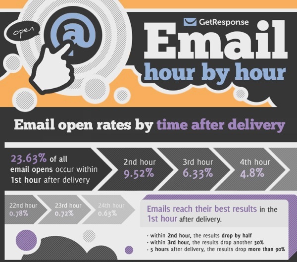
By combining marketing and infographics, you can create great pieces. GetResponse wanted to know the impact of timing on email open rates. Below is their presentation of the data utilizing infographics as part of a larger document to enable readers to easily absorb the information: